Overview
MindTune is a project I did in the SMU UX Design Certificate Program with 4 other team members. We worked together to create an original mobile application. I contributed to the app’s design, from concept to presentation. My responsibilities included: customer research, work-flows, wire framing, prototyping, usability testing, iteration, and high-fidelity prototyping.
Team:
Ponchai Reainthong
Diane Calderon
Michael Ford
Pierce Hunt
AJ McCraw
Role:
Research
Sketching
Wireframing
Prototyping
Usability Testing
Tools:
Mural
Adobe Xd
Trello
Slack
Google Docs
Google Slides
Duration:
4 months
1. Defining The Product
MindTune’s mission is to provide a convenient way to experience music therapy and promote mental wellness.
Main Challenge
How do we make music therapy accessible for all and foster mental wellness in a way that encourages creative expression?
Through research, I found many believe that music therapy is only for musicians or the musically inclined. The truth is, everyone has the ability to benefit from music therapy.
Goals
Design an app that makes music therapy convenient and accessible.
Easy to sign up, select, schedule, and connect with licensed music therapists.
Promote awareness that music therapy is for everyone, not just those who are ‘musically inclined.’
Competitive Research
I investigated the market to evaluate other mental wellness digital services. These included Talkspace, Hummly, Betterhelp, Headspace, and Moodkit.
I was interested in whether they offered music therapy. Only one, Hummly, included music therapy. Also, I was interested in how they navigated onboarding with new users.
Studying other mental wellness apps…
I discovered that there was a lack of music therapy apps in the market.
Competitors provided traditional therapist sessions and/or soothing audio but no interactive music therapy.
Music was mostly being used as a tool for meditation rather than creative expression or working through personal obstacles.
Initial User Research
Empathy Map
I used the online whiteboarding tool Mural to collaborate with my team and create an Empathy Map. This helped make assumptions about MindTune’s target audience.
Spotting Themes
By looking at the empathy map, certain themes began to reveal themselves. We categorized each sticky into a theme which helped gain product clarity.
Epics & User Stories
Epics & User Stories composed on Trello.
I was asked to incorporate an AR (Augmented Reality) or VR (Virtual Reality) component into our app. Here are two user stories I came up with to meet that criteria:
“As a music therapy user struggling with sleep, I need to see sheep jumping so that I can fall asleep.”
“As a music therapy client, I need a way to see myself via AR so I can talk to my past, present or future self in a therapeutic way.”
The ‘past-present-future self’ feature made the final cut. By creating epics and user stories, I learned that an epic is generally large and can contain many product stories. I created 5 user stories and each related back to one of our epics. This was a great way to get the ball rolling and gain product clarity.
2. Feature Ideation
Workflows
Workflows served as a product roadmap allowing me to make multiple iterations on guiding the user through the app. This saved me time before jumping into wire framing. Most importantly, workflows in the beginning helped me spot gaps and overlaps that needed to be addressed before I was too far into high fidelity mockups.
Onboarding Workflow created by AJ McCraw in Adobe Xd.
By creating the workflow in a horizontal arrangement rather than branching downward, I found it easier to spot gaps and overlaps through each functional group. Also, my team members were able to better follow along as I walked them through how I thought the onboarding should progress.
3. Design
Sketching
Visual & UI Design
Colors
The primary color would be a dark blue to convey a feeling of calm and seriousness. But we still wanted secondary colors to convey vibrance and creativity.
Wireframing
After sketching preliminary mockups of menus and overall UI components, I created wireframes to better convey the interface and menu options. The wireframes are blue to keep from distracting from the necessary elements of the app.
Iteration
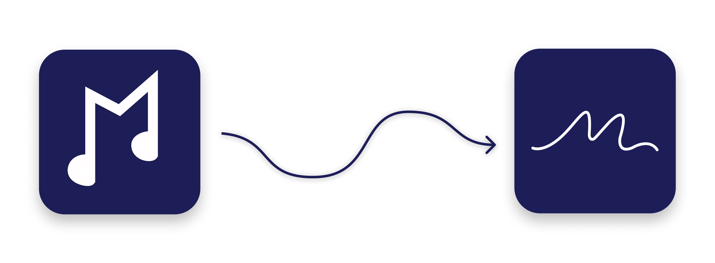
The original branding I created was replaced by a fluid-looking ‘m’ logo. It wasn’t until after presenting the product that I learned the musical note ‘m’ I originally created was technically incorrect. It was brought to my attention by someone who reads music that the curved notes were backwards. That influenced the decision to change the logo completely.
4. Prototyping & Interactions
Above are screens I created in Adobe Xd for the purpose of introducing the user to the product. After some feedback, we were experimenting with fluid shapes and abstract art to possibly incorporate into the design. These screens never made the final product, however. Also, the color scheme changed as we redirected to cooler, less vibrant colors.
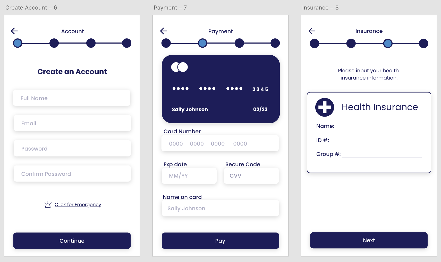
I learned that feedback on where the user is, especially during the onboarding process, was imperative. Users needed a way to see where they were in relation to how much farther they had to complete the onboarding. I did this by including a status bar at the top.
Usability Testing
Takeaways
Onboarding was important as it prepared the user to navigate the app.
Most participants found the idea of music therapy unique and wanted to know more.
Some participants found it confusing where to begin and had questions about payment or health insurance.


